
GMAC reports that over 80% of MBA applicants use a school’s website when deciding which school to attend. Setting up elaborate landing pages, creating user-friendly and mobile-responsive viewbook microsites, and developing a social media voice are all initiatives that leading universities have tackled in the last decade.
However, an area that is seemingly frozen in time is the application section.

Don't leave your applicants out in the cold! Source: Tumblr
Why does it matter?
As you already know, applicants are often getting to know the post-secondary institution they choose online more than they are in person.
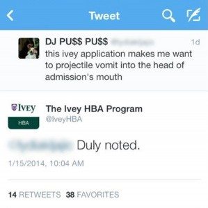 When a student tweeted "this application process makes me want to vomit into the head of admission's [sic] mouth" about the Ivey Business School (Maclean’s), people broke into hysterics about the student’s choice to vocalize her frustrations on social media.
However – for colleges and universities – it reflects a situation that’s all too real: Applying isn’t as fun as it could be.
From dated interfaces to tedious long-form questionnaires, the experience of applying to universities affects the student’s perception of the School itself.
And much like the January weather outside here in Toronto, this process can be cold and disheartening for applicants.
As we mentioned in our November post, Innovative Insights for Admissions Teams, it’s a buyer’s market for universities.
Top students have a myriad of choices, and their personal connection with your school will be a huge factor in their decision. For competitive programs with supplementary applications, institutions have an opportunity to stand out to top prospects by infusing their campus vibe into their application process.
Using techniques to personalize your online application form can warm up your application experience and be the factor that makes your school the top choice for top prospects.
Step 1: Use Names, not Numbers
Researchers have actually proven through brain function, that humans respond positively to hearing or reading their own names. On your website, be more human: After students create their account, reference them by name rather than applicant number. This should be consistent on each page loaded and email sent.
It’s a minor tweak for your development team, but it’s a major tweak in the mind of the potential student when their confirmation email reads:
“Hi Danielle! Your account has been created, best of luck with your application.”
For example, job application software Fitzii walks individuals through their application process in a highly professional and personalized way, allowing companies who use the software to customize the experience in line with their brand.
And, as the team at Fitzii observed through feedback: “Applicants directly correlate the application experience with the brand and culture of the company they are applying to.”
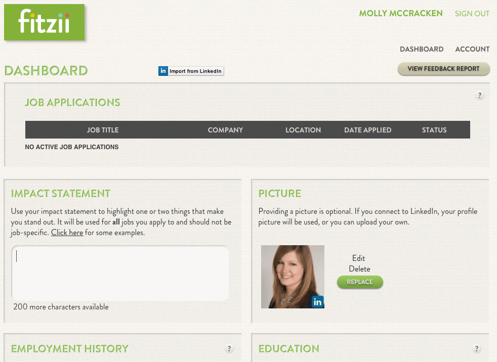
Fitzii Dashboard
When questions come in through social media, also refer to students by their first name and, if possible, integrate social into your CRM (customer/client relations manager) or other applicant tracking system so your team can keep a record of a student’s interactions with the school.
Step 2: Invest in an on-brand admissions section
Working with more than 130 schools around the world, we get it that the back-end of an application process is going to be given a lot less design attention than the front-end. Often, these sections are managed by IT teams and barely glazed over by marketers and web designers.
Yes: Getting people to apply is the goal, but the experience of the application is a huge marketing opportunity. As you write application directions, include campus photos and a welcome message consistent with the overall brand voice.
If you have access to an in-house marketing department, ask them for help in developing messaging and choosing imagery that says “welcome” to your prospects.
Pro-tip: A welcome video for applicants that introduces your dean and your campus is a great way to further drive marketing messaging and inspire further engagement with the school.
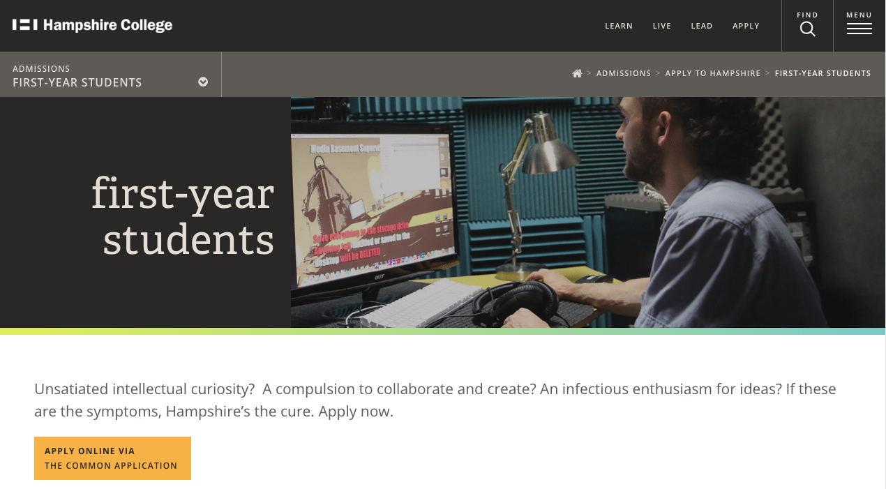
Hampshire College in Amherst has created a very customized portal with specific, branded messaging into the various sections of their applications.
Step 3: Integrate at least one unique performance indicator
Filling out fields and checking boxes can be a repetitive and dull process that says little about the school. From the students’ perspective, this cold, data-driven approach to application reviewing does not make your application process, and in turn, your school, memorable.
Once you have your vision of an ideal applicant in mind, find questions and tests specific to your program that assess core competencies, such as the student’s creativity, leadership or other relevant capacity.
At Kira, we build this type of evaluation system into our platform, and helping our clients select key competencies is one of the main focuses of our Client Success team.
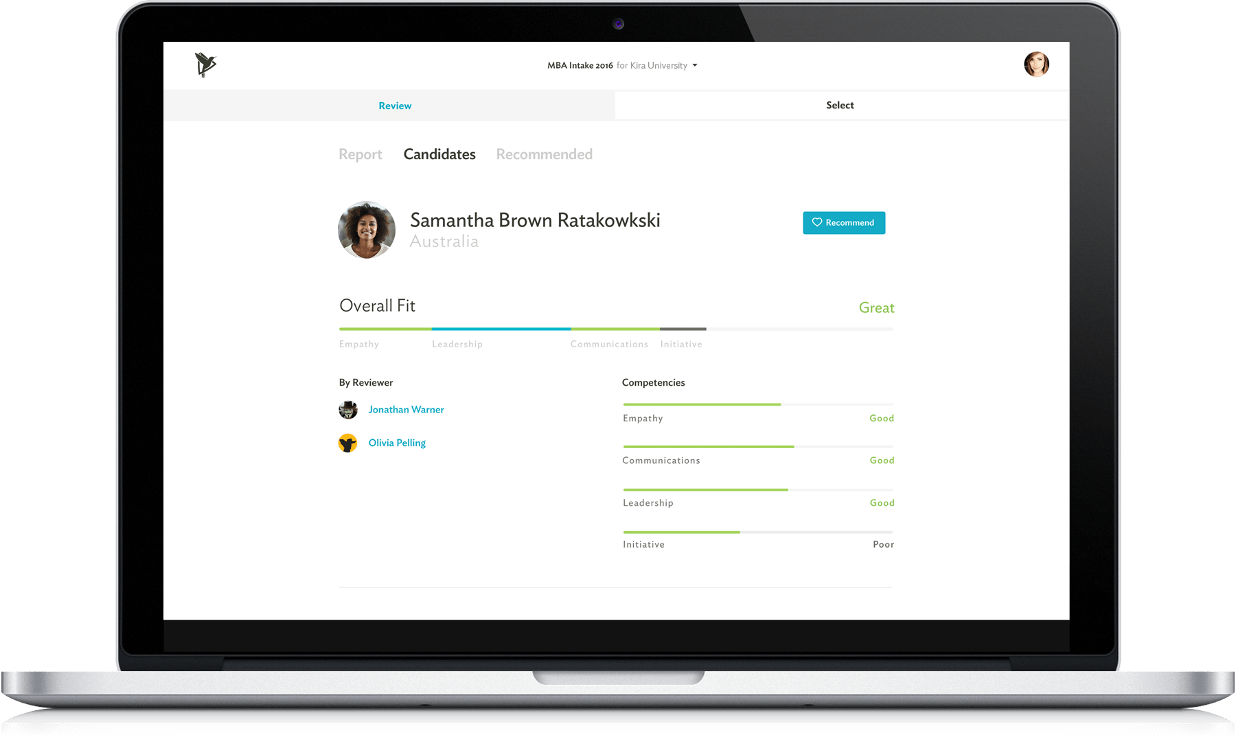
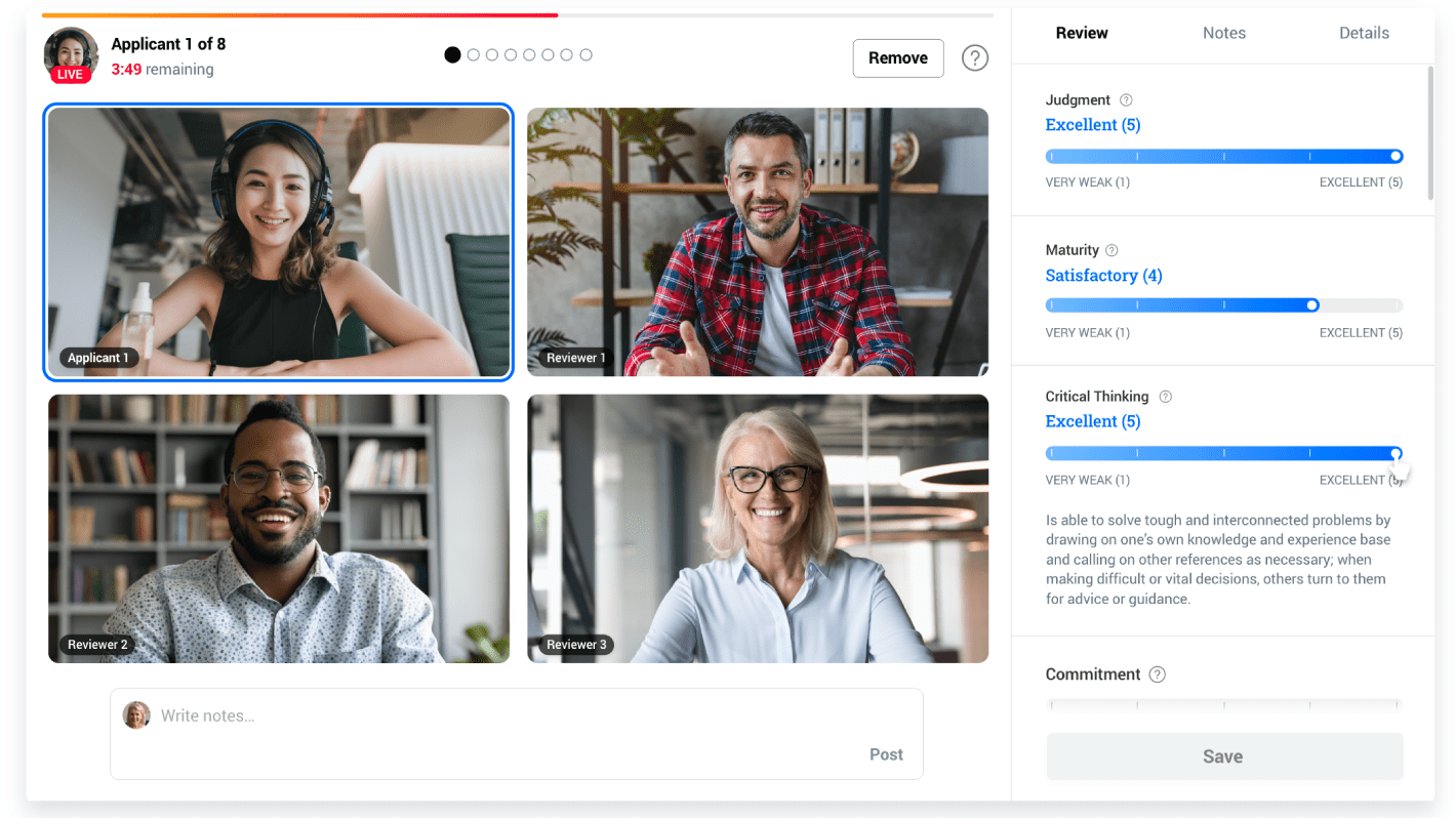
Candidate Review Screen on Kira
Step 4: Test everything with your ideal student in mind
Nielsen Norman reports that 85% of UX problems can be solved by testing with 5 users. Smashing Magazine also concludes that 68% of users give up because they don’t think you care about them.
As you likely aren’t responsible for the development of the admissions interface directly, encourage your IT team or web development firm to invest the time and effort in user testing with subjects who fit your program’s target demographic.
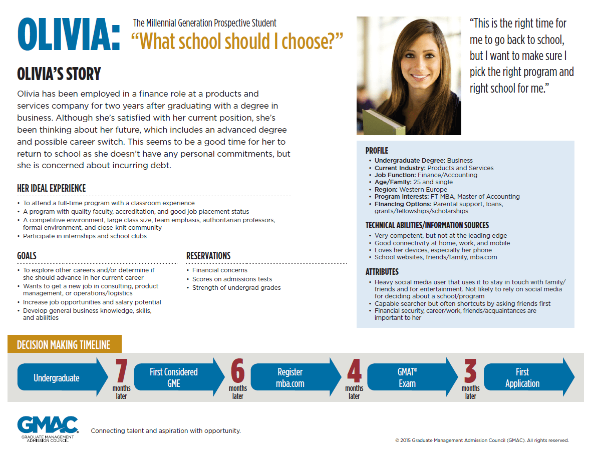
Just as you would for a marketing initiative, provide clear goals and user personas of your ideal applicants to help the developers out. You want your applicants to feel like your admissions process stands out and has been built with them in mind.
Here’s a great persona example from GMAC:
After all, in the competitive world of higher education, your applicants can’t afford to be generic; and neither can your school.
Let us know how you’ve made your admissions process special in the comments!
